Voyager AI Coach BETA
The new Voyager AI Coach guides userUser User means a person who uses or consumes a product or a service, usually a digital device or an online service. requests with intelligently routed, always-available access, and seamless integration with the incredible depth of knowledge available from both our SalesPOP! Experts and Pipeliner Knowledge Base.
The AI Coach is available directly from the main menu across CRM and all tools, opening in a persistent chat window. Users can start new conversations, access recent history, and interact through text or speech input. Conversation history is saved per user, making it easy to pick up where you left off.
Responses are formatted for clarity with bold highlights, lists, and named links.
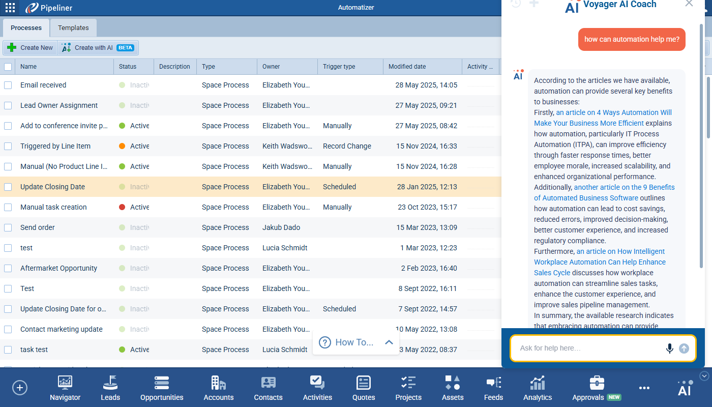
Our aim is to empower sales teams to move faster, stay informed, and make better decisions from inside Pipeliner CRM as well as get easy access to “how to” guidance.
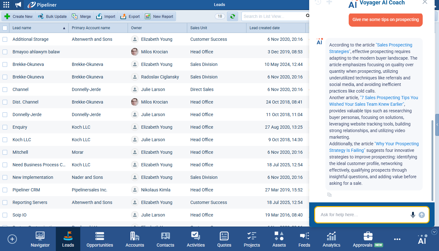
The Voyager AI Coach is being released as a BETA version and will be enabled by default for all existing activated Voyager AI Hub Items. It has access to the following sources via 2 subordinate agents:
- SalesPOP Agent › operates on the SalesPOP database which contains:
- Documents
- Articles/Blogs
- Podcasts
- Link to YouTube videos + transcription
- Help Agent › operates on the Help database which contains:
- Help articles
- URLs
Fullsize Screenshots ⤵
Navigator
Experience Pipeliner CRM Now
We’ve worked on improving usability of our new Navigator 2.0 in this release. The primary goal has been to enhance user experience and comprehension by introducing a wizard-like, guided setup for components, improving consistency of the user interface, and adding new dataData Data is a set of quantitative and qualitative facts that can be used as reference or inputs for computations, analyses, descriptions, predictions, reasoning and planning. visualization capabilities. The scope also includes system-wide updates to saving behavior, data loading, and formatting.
Guided Settings (Wizard Implementation)
A guided, step-by-step configuration flow was implemented for several components – Tile, Insights, Target Chart, KPI Chart and Grid. We’ve added numbered instructional texts and reorganized/relabelled some of the settings.
Component-Specific Updates
Agenda Component
- Added a Display Options label above the group of display-related checkboxes.
- The existing setting to expand overdue tasks was converted to a toggle, moved to the first position under Display Options, and relabeled to Show Overdue Tasks Expanded.
- The sorting order for overdue activities was changed to descending (DESC). This change applies to both the Navigator Agenda component and the agenda within the activity screen.
- A new Custom option was added to the period selector, allowing the user to define the upcoming period in days. The input has a default value of 14 and a max value of 999.
- Two new Filter sub-tabs have been added: Activity and Opportunity. These filters replicate the functionality of the filters in their respective preview screens (main fields + all related fields) and display a badge indicating active filters.
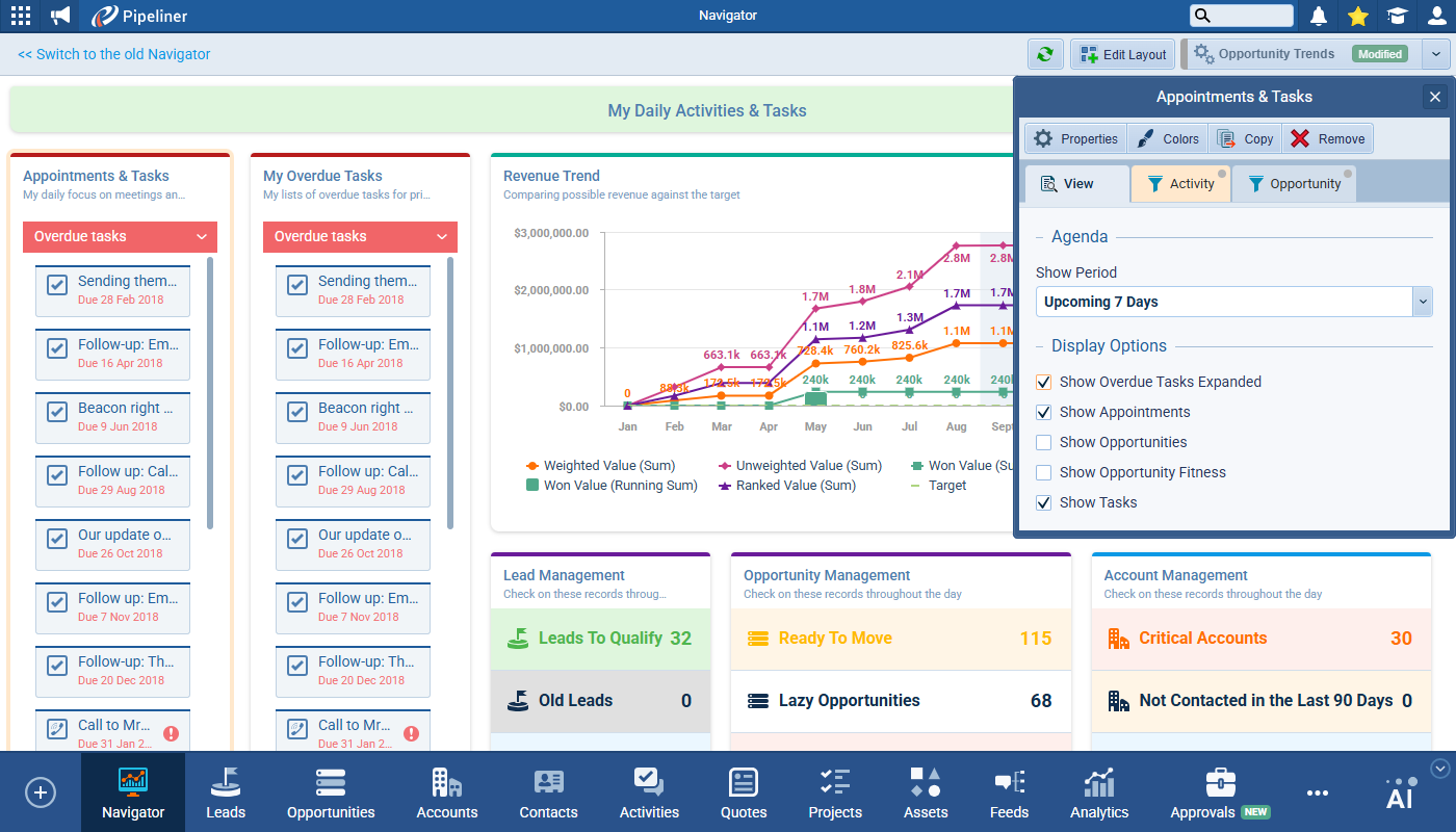
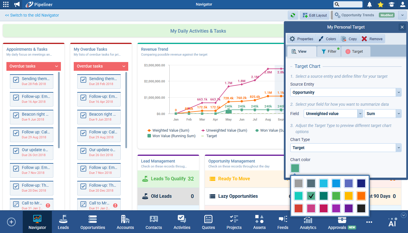
Opportunity Trend Component
The chart now displays numerical values directly on the data points. This behavior mirrors charts in reports, including number shortening (e.g., 10,000 to 10k).
A “Today” indicator has been added to the chart. It was implemented as a highlighted group for the current day. The indicator is hidden if the current day is outside the selected period range.
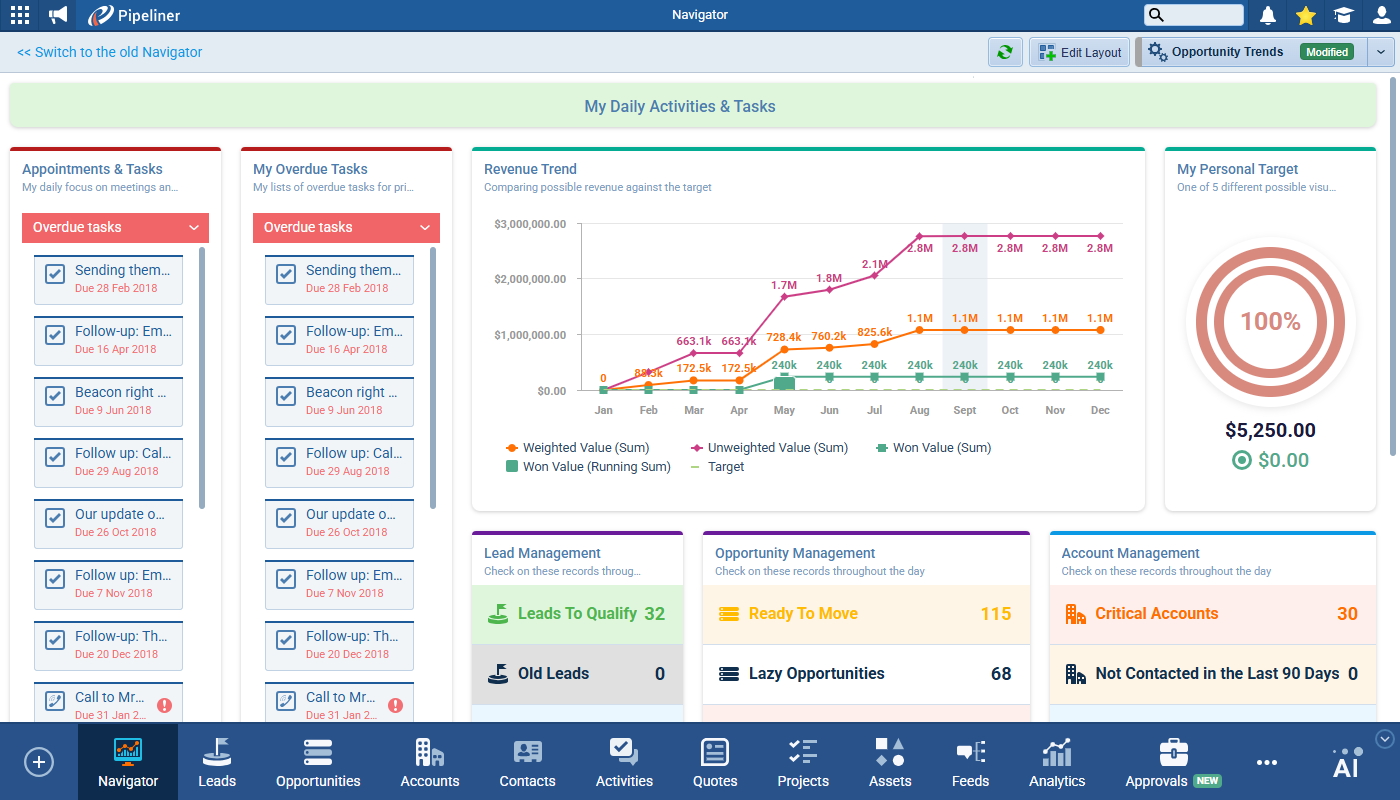
RevenueRevenue Revenue is the amount of money a business generates during a specific period such as a year or a quarter; also called sales. Trend Component
Within the settings for the Revenue Trend component, we’ve added a label Select Series (Y-axis) above the series checkboxes and renamed the label for the period selector to Choose Period (X-axis).
Target Component
- A chart color selector was added to the bottom of the settings pane (this selector is the same as is used in Reports chart settings).
- The default color remains Green.
- The color selector is not disabled when the Target Chart Type is set to “Target“. User is able to change the color of the target value.
System-Wide Changes & UI Enhancements
Saving Behavior
- The component saving mechanism was updated to remove the explicit Save button confirmation.
- All component changes will be saved instantly as a draft.
- In Navigator, changes save instantly to the draft profile.
- In Dashboards, changes save instantly to the dashboard’s draft (save button remains).
- NOTE: Report saving behaviour remains the same – they must be saved manually; it does not affect Navigator.
Data Loading OptimizationOptimization Optimization is the process or act of altering a system, design, or procedure such that it 1) attains full functionality or efficiency, or 2) generates maximum output, benefit, or impact.
- The data loading for Insights and KPI List components was optimized.
- Each item within these components loads separately to improve perceived performance. Each component will load sequentially from top to bottom.
Conditional Formatting
A Value label was added to the conditional formatting rule popup to clarify that the condition is applied to the aggregated result.
The color palette for conditional formatting was expanded. The new palette was sourced from “Reports › Field conditional formatting rules” and slightly changed. The previous color palette was retained as a subset of the new one to ensure backward compatibility and avoid data migration.
General UI Updates
- Component Titles: Added single-line rich text support to all component titles. The rich text toolbar has the “Bold” option removed (font will be bold by default) and has font coloring options added.
- Number Formatting: All components that display a number via a “Count” aggregation are applying number formatting according to the user’s region.
- Tab Visibility: For components like Insights and Quick Links, the View tab is hidden if it is the only tab present.
- Empty States: Added placeholder text for when components have no data.
- Insights have a placeholder when no insights are configured.
- Quick Links have a “No URLs Added” placeholder when the list is empty.
- Labeling: The top-level component section previously labeled Notifications was renamed to Insights.
Fullsize Screenshots ⤵
Forecasts
This release includes significant improvements to the ForecastingForecasting Forecasting is a prediction or calculation of a trend or event likely to occur in the future based on qualitative, quantitative and historical data as well as emergent but relevant factors. tool. The primary changes include a new multi-step wizard for forecast creation with descriptive text to better explain what happens in each step, an overhaul of QuotaQuota Quota is a predefined benchmark indicating the amount of sales a selling unit such as a sales rep or a regional sales team should achieve within a given period, often used as a measure of success, performance and eligibility for commissions and other rewards. management with “Simple” and “Custom” modes, and a enhancements to the Forecast Detail view. The goal is to streamline the setup process, provide more flexible quota handling, and improve the overall usability and clarity of the forecasting tool.
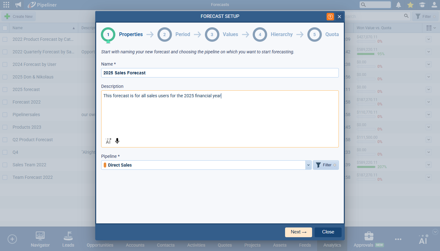
Forecast Setup Wizard
A new 5-step wizard will guide users through the forecast creation process. A stepper component at the top will indicate the current step and allow navigation between completed steps when editing an existing forecast.
Step 1: Properties
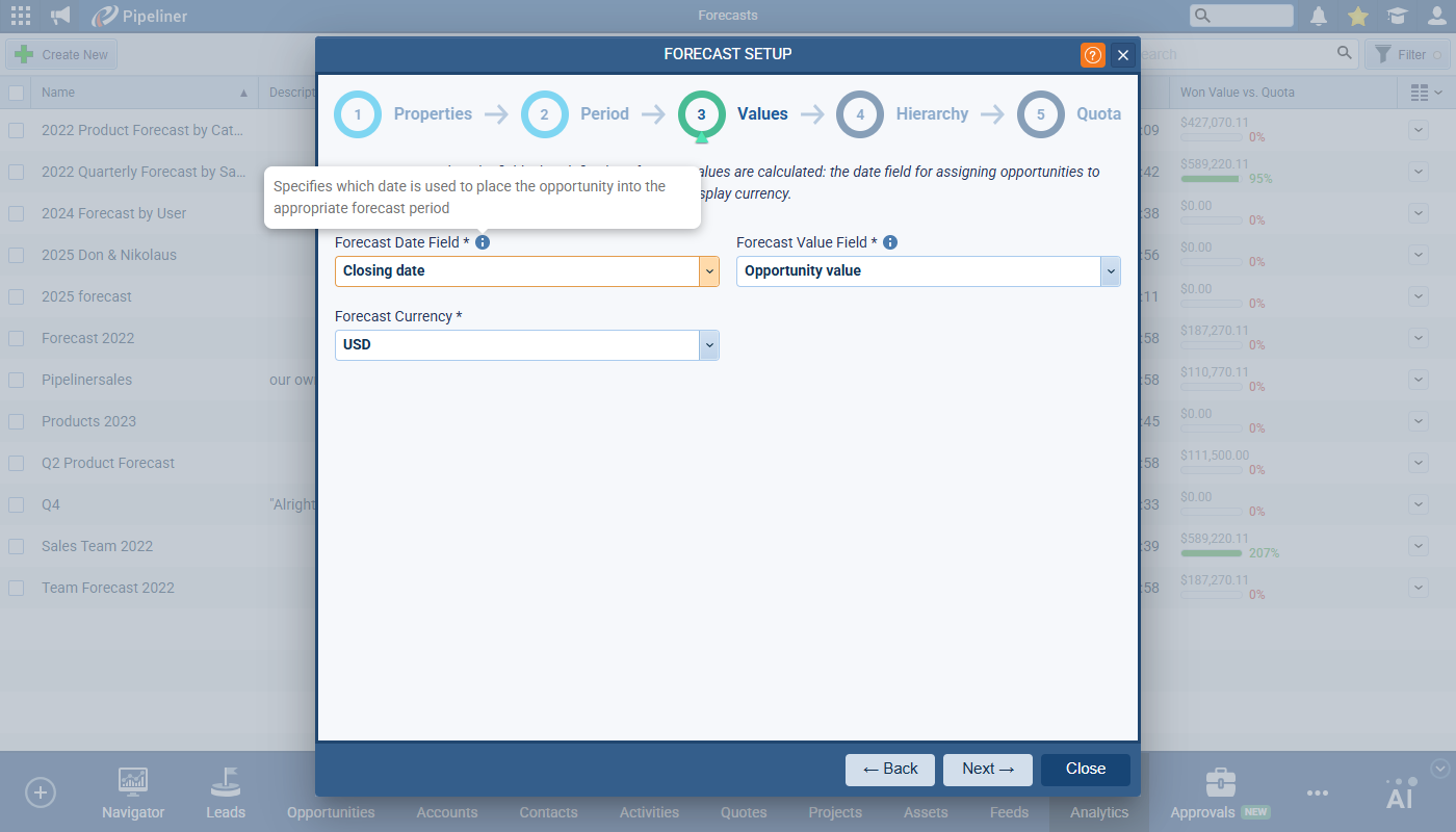
This step includes Name, Description (with added “AI” and “Speech-to-text” functions) and the PipelinePipeline Sales pipelineis a visual representation of the stage prospects are in the sales process. selector with Filter option.
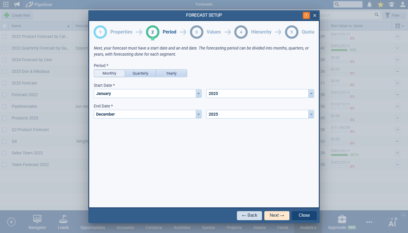
Step 2: Period
This step includes the Forecast Period — Monthly, Quarterly or Yearly — as well as Start Date and End Date for the Forecast.
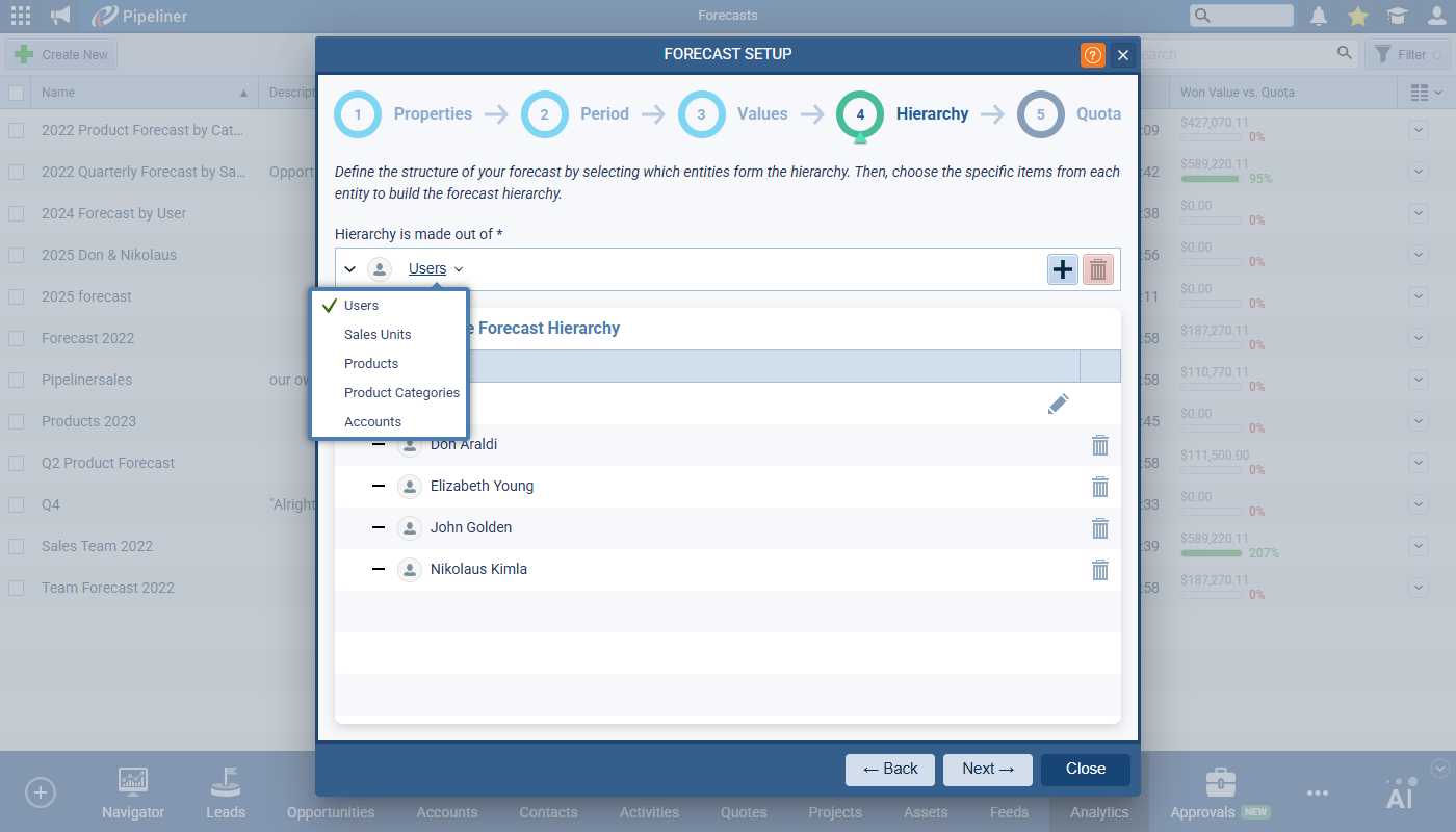
Step 4: Hierarchy
This step includes the Hierarchy selection setting — e.g. forecasting by User or by ProductProduct Product refers to anything (an idea, item, service, process or information) that meets a need or a desire and is offered to a market, usually but not always at a price. — and the Hierarchy builder where you select the include values — e.g. selected users or sales units.
Step 5: Quota
This step is redesigned with two distinct modes for quota management:
- Simple Mode › this is the default state when the Custom Mode switch is turned OFF
- Custom Mode › toggle the switch to turn Custom Mode ON
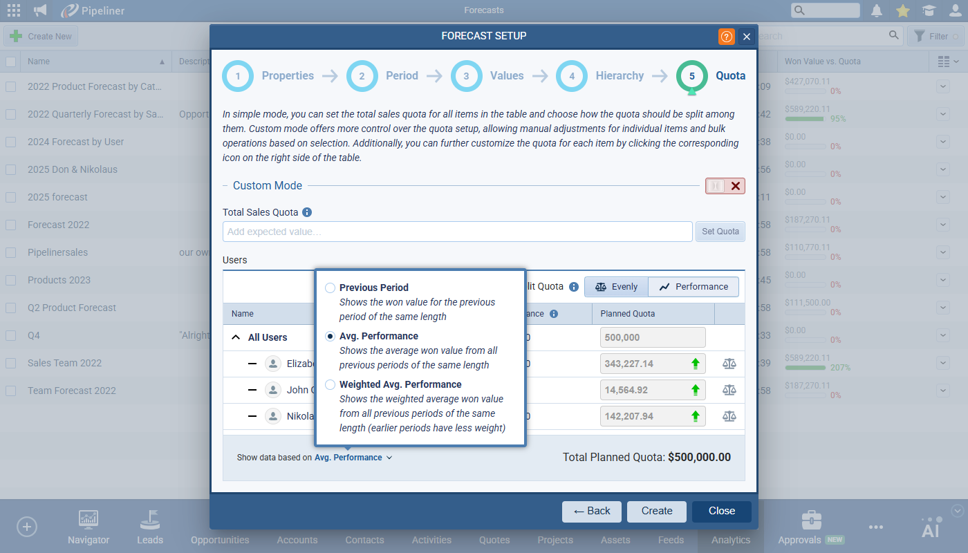
Quota – Simple Mode
This mode will work for the majority of situations when you want to set the quota for each item/user evenly, or according to historical performance. Advanced quota management is disabled in this mode.
Fill in the Total Sales Quota value and click on Set Quota to distribute the value across the grid items based on the selected “Split Quota” option. The Total Sales Quota value field is then cleared.
Split Quota defines how the “Total Sales Quota” is distributed. Choose between “Evenly” (default) or “Performance” options. Once selected, the Planned Quota input fields are disabled for all rows. Click on the Individual Quota button to the right of the Planned Quota to open the individual Quota Planning set up view
You can choose to “Show data based on” one of three radio options — Previous Period, Average Performance or Weighted Average Performance — each of which will look back in time to show historical performance values for each unit (user, product, sales unit) based on previous time periods.
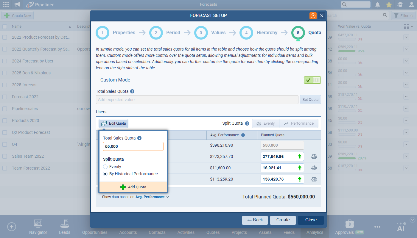
Quota – Custom Mode
In this mode, you have full control over quota management, including manual input and item selection. When Custom Mode is switched on, the Total Sales Quota field and Set Quota button are disabled. The “Edit Quota” button is disabled until at least one item is selected in the grid. Select one or more items and then click on Edit Quota to enter the Total Sales Quota and decide how it should be split — Evenly or By Historical Performance. The Planned Quota fields are enabled for the lowest level items in the hierarchy so you can overwrite and tweak quota values.
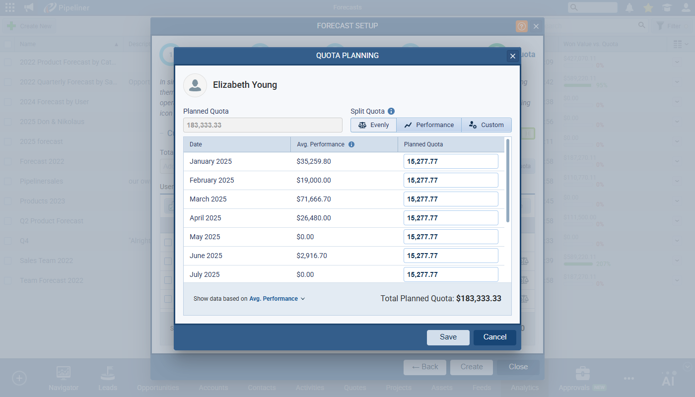
Individual Quota Planning
Clicking on the scale icon to the right of the Planned Quota value opens up a new window for editing an individual item’s quota. This screen is also updated for both modes.
In Simple Mode, the user is allowed to distribute quota among periods evenly or by considering historical performance. The ‘Custom’ option in the ‘Split Quota‘ button bar and all ‘Planned Quota’ input fields are disabled.
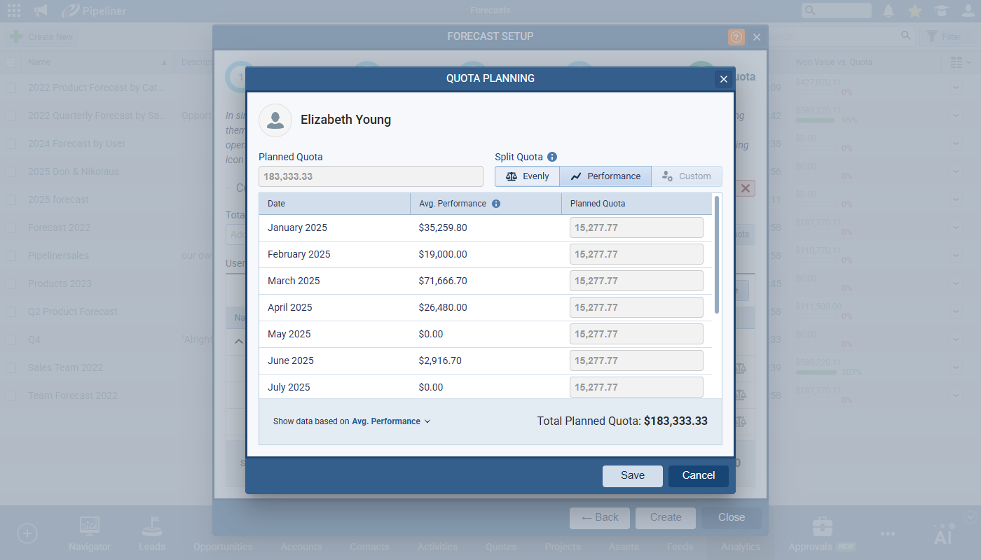
In Custom Mode, the user has full control over quota distribution — the ‘Custom‘ option is enabled and ‘Planned Quota‘ fields are editable.
Forecast Detail View
When a user clicks Create to create a new Forecast, the “Won + Open Value (Unweighted) vs. Forecast” cell for the total row will be selected and the pipeline view in the drilldown options will be opened. We have expanded the view selector in drilldown so it’s easier to switch between Pipeline, Chart or List.
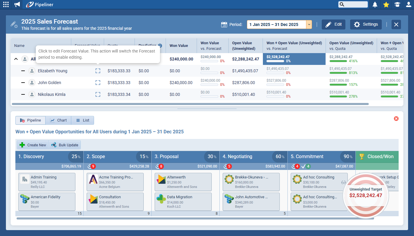
Users can customise the grid by dragging and dropping columns. Note that the Name, Forecast Value, and Quota columns have fixed positions and cannot be moved and no other column can be moved in front of or between them so the first re-orderable position is the 4th column slot (after Quota).
When viewing the full date range — e.g. Jan 1 — Dec 31 — the Forecast Value is not editable directly but we’ve added a clickable “dashed square” icon to each row. Clicking it switches the view to a single period (prioritizing the period containing the current day) to allow editing.
The Prediction field is added to the list of visible columns and can be added/removed from the table. It will be still present by default for all new forecasts
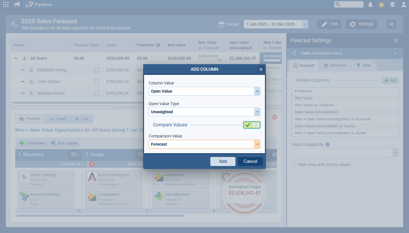
In Settings › Forecast Settings, the Add column option has been improved to show only relevant settings for the current selection. We’ve added a ‘Compare Values‘ toggle, which shows the ‘Comparison Value’ field when ON.
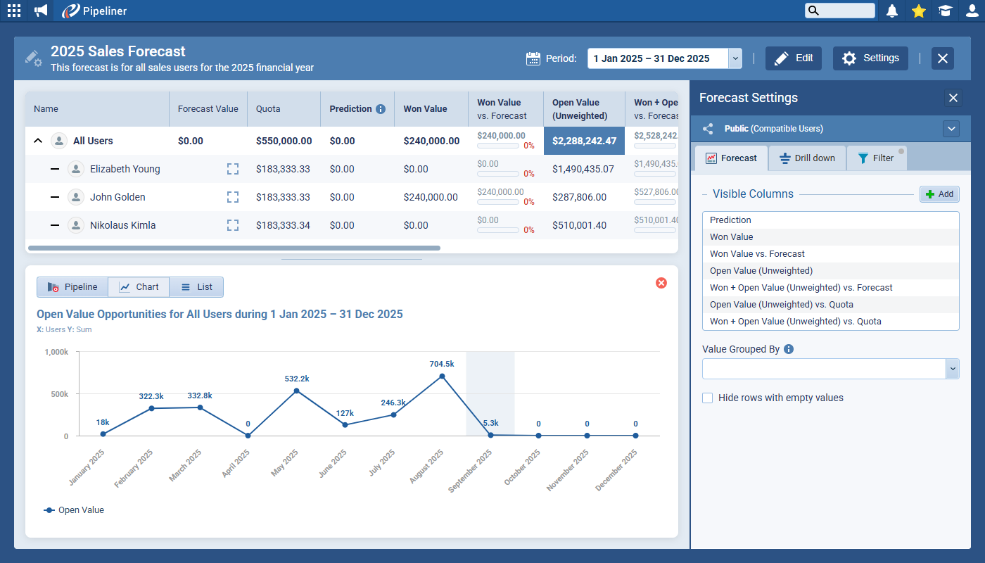
Line Chart Improvement
The chart category corresponding to the current day is visually highlighted and values will be displayed directly on data points if space permits.
Fullsize Screenshots ⤵
Various Improvements
As part of our ongoing usability enhancement program, we’ve updated the following features.
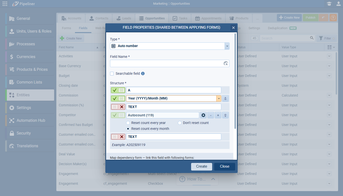
Admin › Entities › Autonumber Fields
When a date option is added to the sequence pattern, there is now an option to reset the counter every month/year. This will be turned on by default. The counter offset will also work when date part is added to the sequence.
LeadLead Lead refers to a prospect or potential customer (who can be an individual or organization) that exhibits interest in your service or product; or any additional information about such entity. Lost Date Field
We’ve added a new shared field Lost Date for Lead (and also for Opportunity) to allow for more specific reporting. The new field is a datetime field showing the date and time when the when selected Lead is Archived as “Lost”. This can be used in KPI information and for every view and filter and will also be available on the Mobile app.
Fullsize Screenshots ⤵