Instant Dynamic Visualization

Pipeliner CRM – The most visual and dynamic CRM reporting available today!
Visual sales dashboards

We have had versatile reports in Pipeliner CRM for many years. They have now been enhanced with instantly visual dashboards and now your dataData Data is a set of quantitative and qualitative facts that can be used as reference or inputs for computations, analyses, descriptions, predictions, reasoning and planning. is instantly visual!

With the addition of line graphs, bar, or pie charts, and customization from Pipeliner CRM’s totally unique Power Panel, reporting has never been so powerful.

“The greatest value of a picture is when it forces us to notice what we never expected to see.”

John Tukey, MathematicianJohn Tukey, Mathematician

Data Visualization

Why does it matter?

Visual data analytics

The human brain can process an image in just 13 milliseconds — Source › MIT.

Data visualization can shorten meetings by 24% — think of the time savings for sales or strategy meetings. Plus teams experienced a 21% increase in their ability to reach consensus by using data visuals. Source › Wharton School of Business.

According to Bain, companies that use data analyticsAnalytics Analytics is the active study of different types of data with the aim of discovering meaningful patterns and translating these into insight (such as historical analyses and forecasts), or action (such as those intended to improve business performance). are twice as likely to be in the top quartile of financial performance within their industries.

The increasing adoption of data visualization in small and medium enterprises is expected to fuel the growth of the data visualization market according to Data Visualization Market — Growth, Trends, COVID-19 Impact, and Forecasts (2021 – 2026) report from Research And Markets.

People working with data spend a full 44% of their workday on unsuccessful data activities according to an IDC report. In sales management and sales operationsSales Operations Sales Operations is a collection of aligned business processes, strategic implementations and other activities aimed at achieving organizational goals, specially in the areas of sales revenue, market coverage and growth., this is a huge drain on resources and focus.

Pipeliner CRM Performance Feature

Adding Dashboards to Reports

Adding Dashboards to Reports

  • Add a chart to your report

  • Pie Chart

  • Line Chart (single & multiple)

  • Bar Chart

  • Instantly available, easily changed!

“Visual communication is a must-have skill for all managers.”

Power Panel & Profiles

  • Easily select what you want to view

  • Save selections as Profiles

  • Save all the parameters you select from the different tabs (View, Role, Filter, Target)

  • Edit the layout (drag n drop to add or subtract elements & even resize & rearrange them)!

“If you can’t explain it simply, you don’t understand it well enough.”

Albert Einstein, Theoretical physicistAlbert Einstein, Theoretical physicist
Power Panel and profile feature

Adding Data Examples…

There are many data points you can include — for example opportunity name, primary contacts, state, number, leadLead Lead refers to a prospect or potential customer (who can be an individual or organization) that exhibits interest in your service or product; or any additional information about such entity. source, country, lead type, and many more. you can add any of those to the dashboard as well. You can then add the data from the report, and the graph is created.

Business overview report - multiple data points

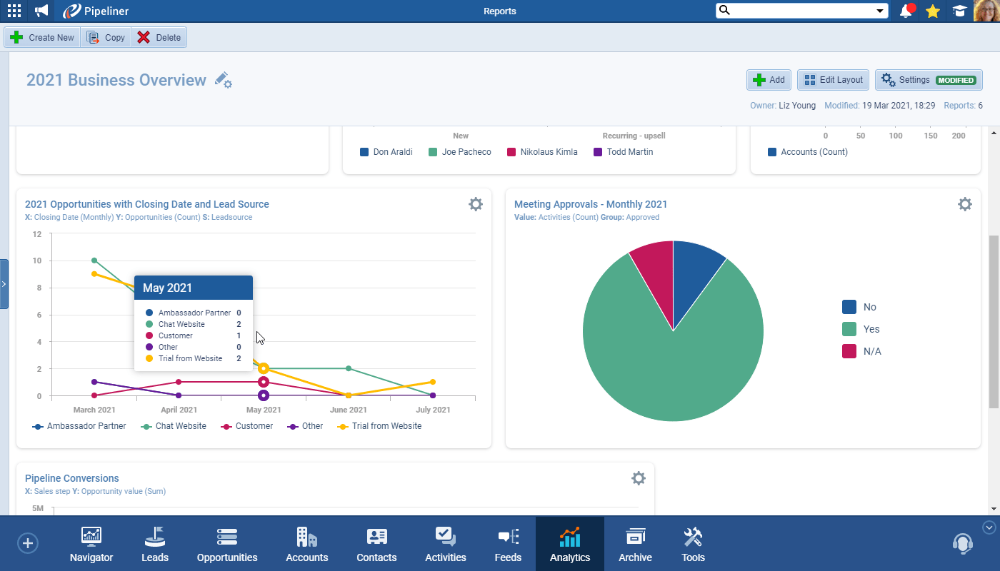
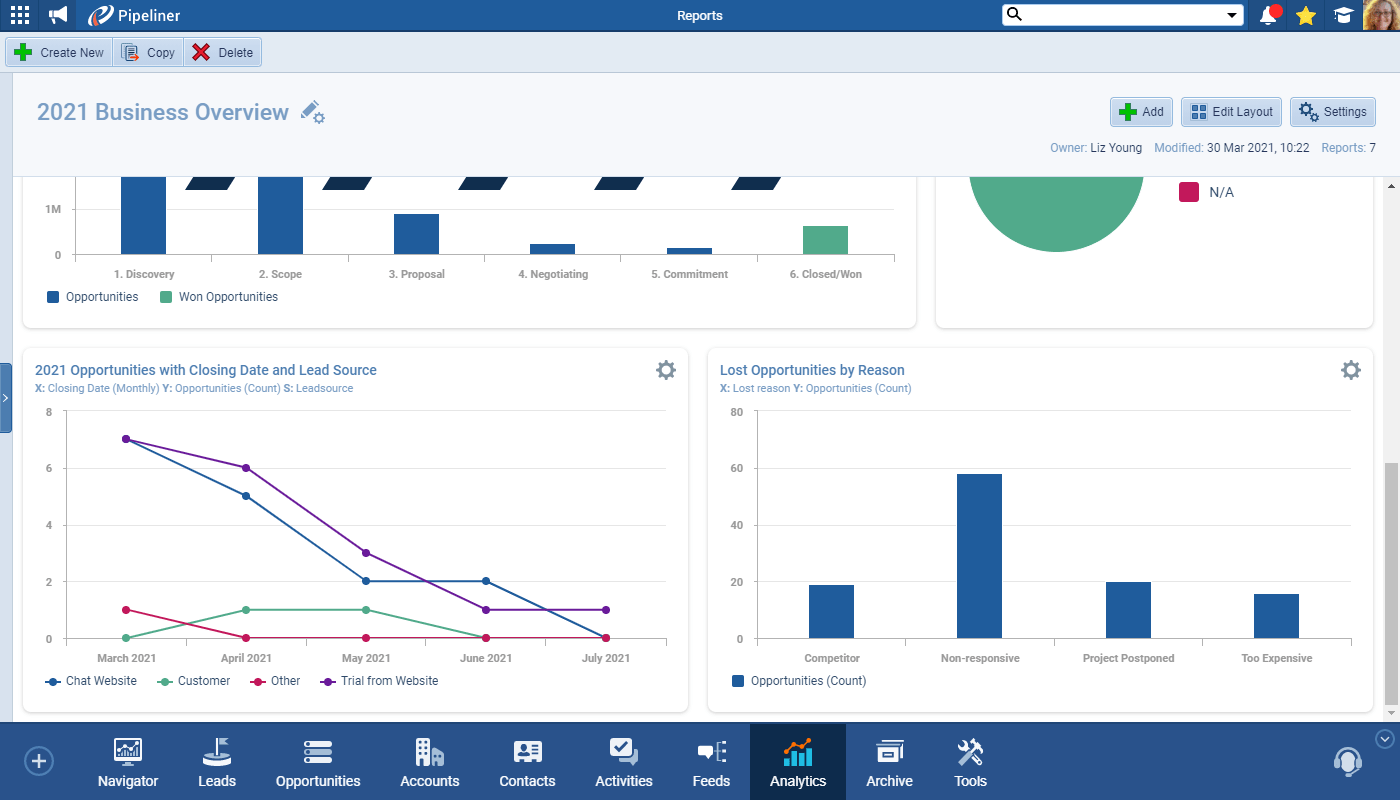
In another example, you want to create a graph of opportunities, showing closing dates. You can create a multiple-line chart of opportunities, showing different lead sources. You can also change it into a different kind of chart, such as a pie chart or bar chart.

graph of opportunities showing closing dates

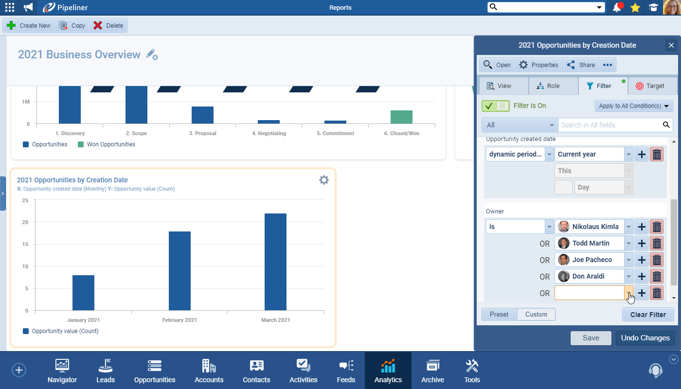
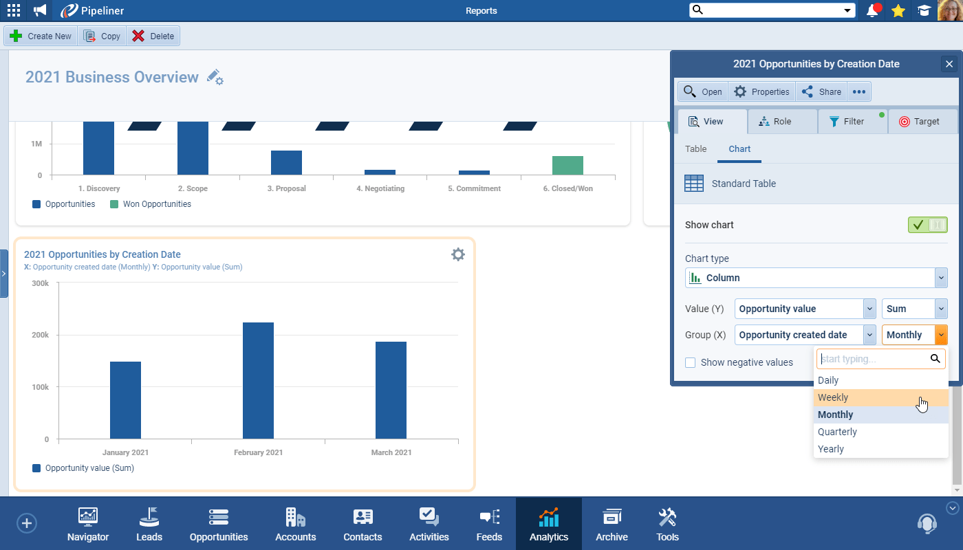
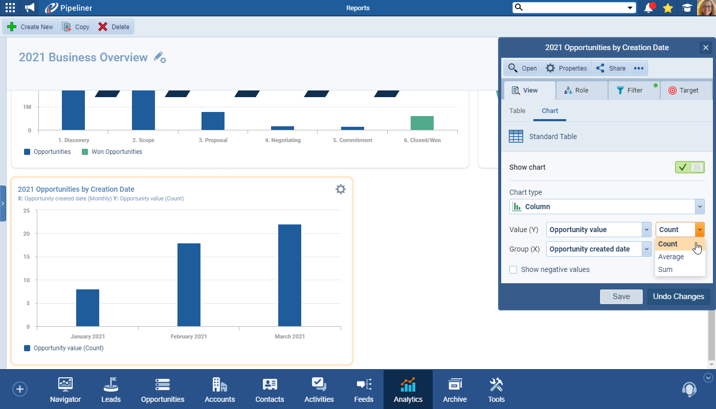
Or, you could create a graph of opportunities by creation date. You can then make adjustments as needed with Edit Layout. You can then see opportunities created by month, or by quarterQuarter Quarter is a three-month period in a company’s fiscal year commonly used to make comparative performance analyses, detect or forecast business trends, report earnings, and pay shareholder dividends., or any other time segment.

create a graph of opportunities by creation date

You can then turn this into a multiple-line graph. You can again use the Power Panel to include or remove certain sales reps, or to include lead sources like before.

You can create multiple-line graph

As with other functions within our new Insight features, you can drill all the way down to individual opportunities, and even to the opportunity details.

functions within our new Insight features, you can drill all the way down to individual opportunities, and even to the opportunity details.

Additional Resources