Every sales leader knows the feeling. You’re staring at rows and rows of opportunities in your CRM, trying to answer what should be simple questions. Which deals need attention right now? Where are the most significant opportunities hiding? What’s actually going to close this quarterQuarter Quarter is a three-month period in a company’s fiscal year commonly used to make comparative performance analyses, detect or forecast business trends, report earnings, and pay shareholder dividends.?
Traditional CRM views force you to work harder than you should. Spreadsheet-style lists reduce every opportunity to a line of text, stripping away context and making it nearly impossible to see the bigger picture. Standard pipelinePipeline Sales pipelineis a visual representation of the stage prospects are in the sales process. boards show you stages, but they treat a $5,000 deal the same as a $500,000 deal. Critical information gets buried. Patterns go unnoticed. And before you know it, your team is fighting fires instead of strategically closing business.
The truth is, your pipeline dataData Data is a set of quantitative and qualitative facts that can be used as reference or inputs for computations, analyses, descriptions, predictions, reasoning and planning. contains powerful insights. But when that data is trapped in flat, one-dimensional views, those insights remain invisible. Sales managers spend hours manually sorting, filtering, and cross-referencing to understand what’s really happening. Reps waste time on low-value activities because they can’t quickly identify where to focus. RevenueRevenue Revenue is the amount of money a business generates during a specific period such as a year or a quarter; also called sales. leaders make forecastingForecasting Forecasting is a prediction or calculation of a trend or event likely to occur in the future based on qualitative, quantitative and historical data as well as emergent but relevant factors. decisions based on incomplete pictures.
This isn’t just inefficiency. It’s a competitive disadvantage.
What If You Could See Everything at Once?
Imagine opening your CRM and instantly understanding the health of your entire pipeline, not by reading through data, but by seeing it. Large deals jump out immediately. Opportunities approaching their close dates are obvious. Stalled deals reveal themselves through their position on the screen. No clicking. No filtering. No mental gymnastics.
This is precisely what Pipeliner CRM’s Bubble Chart View delivers.
The Bubble Chart View represents a fundamentally different approach to pipeline visualization. Instead of forcing you to process information linearly, it presents your opportunities as an interactive visual landscape where multiple data dimensions are visible simultaneously.
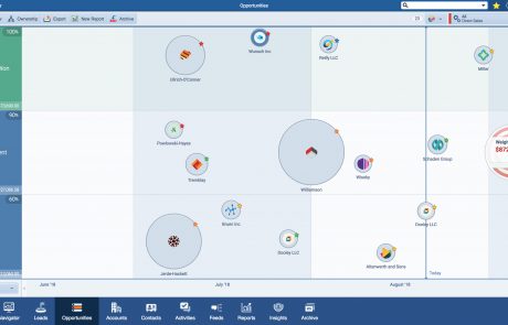
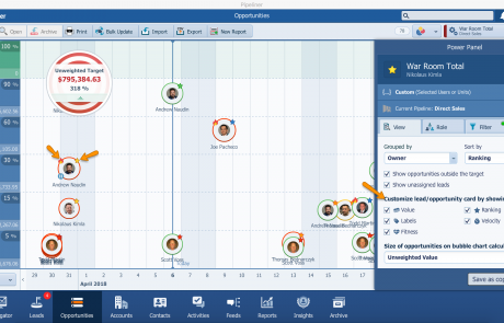
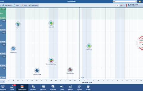
Each opportunity appears as a bubble on the chart. The bubble’s horizontal position shows you which sales stage the opportunity has reached. The verticalVertical Vertical refers to a market where a business targets only a small subset of customers such as a specific industry, sector, profession, or niche. For example, manufacturers of jet plane engines cater only to companies that produce or maintain jet planes. position indicates when the deal is expected to close. And the size of the bubble reflects the deal’s value. Three critical data points, unified in a single glance.
This multi-dimensional approach transforms how you interact with your pipeline. Patterns that would take minutes or hours to discover in traditional views become immediately apparent. A cluster of large bubbles near the top of the chart? Those are your high-value deals approaching their close dates—exactly where your attention should be. Small bubbles scattered across the early stages? That’s your developing pipeline, showing you what’s coming down the road. A gap in certain areas? That’s a potential forecasting problem you can address before it impacts your quarter.
Beyond Static Charts: A Fully Interactive Experience
What truly sets the Bubble Chart View apart from standard reporting tools is its interactivity. This isn’t a static snapshot you export and analyze elsewhere. It’s a living, breathing view of your pipeline that you can work with directly.
Click on any bubble, and you’re immediately connected to that opportunity. Update the deal value, add a note, schedule a follow-up activity, or move the chance to a new stage—all without leaving the Bubble Chart View. The changes you make are reflected in real-time, and the bubble adjusts its position and size accordingly.
This seamless integration between visualization and action eliminates the friction that typically exists between analysis and execution. You don’t have to identify an insight in one view, then navigate somewhere else to act on it. The Bubble Chart View keeps you in flow, moving from observation to action in seconds.
For sales managers running team meetings, this interactivity is transformative. Pull up the Bubble Chart View on a shared screen, and suddenly everyone can see what’s happening across the pipeline. Discuss specific deals by clicking directly on their bubbles. Make updates during the conversation. The visual nature of the view keeps everyone engaged and aligned, turning pipeline reviews from tedious data recitations into strategic discussions.
Solving Real Problems for Real Sales Teams
The Bubble Chart View addresses specific challenges that sales professionals face every day.
For the overwhelmed sales rep, it provides instant clarity on prioritization. When you can visually see that one bubble is three times larger than the others and positioned near its close date, you don’t need a manager to tell you where to focus. The view itself guides your attention to the highest-impact activities.
For the data-driven sales managerSales Manager Sales Manager is an executive who leads a sales unit, team or department by setting goals and meeting targets, formulating plans and policies, designating tasks, and developing salespeople., it offers pattern recognition at scale. Identifying trends across dozens or hundreds of opportunities becomes intuitive rather than analytical. You can spot which reps have healthy pipelines and which need support. You can see whether your team’s opportunities are progressing or stagnating. You can identify seasonal patterns and adjust strategies accordingly.
For the strategic revenue leader, it enables confident forecasting. When you can visually assess the distribution of opportunities across stages and timelines, weighted by their value, you develop a more accurate intuition for what’s likely to close. The Bubble Chart View doesn’t replace detailed forecasting analysis, but it provides a powerful sanity check and helps you ask better questions.
For the entire organizationOrganization Organization is a cohesive group of people working together and formally bound by a shared identity (e.g., one team, company, club, etc.) and a common purpose (e.g., business growth, athletic victory, etc.)., it creates a shared visual language for discussing pipeline health. When everyone can see the same picture, conversations become more productive. Instead of debating whose spreadsheet is correct, teams can focus on strategy and execution.
Part of a Complete Visual System
The Bubble Chart View doesn’t exist in isolation. It’s one of seven distinct views available in Pipeliner CRM, each designed to serve a specific purpose. The Pipeline View shows stage-by-stage progression. The List View enables detailed data manipulation. The Compact View provides deep dives into individual records. The Map View reveals geographic distribution. The Calendar View organizes time-based activities. The Task Board View manages workflow.
What makes this system powerful is the seamless movement between views. You might start your day in the Bubble Chart View to get a high-level sense of your pipeline, then switch to the List View to update specific fields across multiple records, then move to the Compact View to prepare for an important call. Your data remains consistent across all views, and each view adds a new dimension of understanding.
This flexibility means you’re never forced into a one-size-fits-all approach. Different situations call for other perspectives, and Pipeliner CRM gives you the tools to align your view with your immediate need.
Transform How You See Your Pipeline
The way you visualize your sales data directly impacts how effectively you can manage it. Flat, text-based views hide insights behind walls of information. The Bubble Chart View tears down those walls, presenting your pipeline as a rich visual landscape where insights surface naturally.
Sales teams using visual pipeline tools report faster decision-making, improved prioritization, and more productive pipeline conversations. When critical information is immediately visible rather than buried in data, everyone performs better.
The Bubble Chart View represents Pipeliner CRM’s commitment to visual intelligence. We believe that sales professionals shouldn’t have to work hard to understand their own data. The correct visualization makes complex information simple, turning your CRM from a data repository into a strategic advantage.
Experience the Difference
Seeing is believing. The Bubble Chart View is available to all Pipeliner CRM users as part of our comprehensive visualization suite. If you’re already a Pipeliner CRM customerCustomer Customer is an individual or an organization that purchases a product or signs up for a service offered by a business., switch to the Bubble Chart View in your Opportunities menu and experience multi-dimensional pipeline visualization for yourself.
If you’re new to Pipeliner CRM, we invite you to see how visual CRM can transform your sales operationsSales Operations Sales Operations is a collection of aligned business processes, strategic implementations and other activities aimed at achieving organizational goals, specially in the areas of sales revenue, market coverage and growth.. Request a personalized demo and discover why thousands of sales teams trust Pipeliner CRM to help them see their pipeline clearly and close more deals.
Your pipeline is full of insights waiting to be discovered. The Bubble Chart View helps you find them.
Ready to visualize your pipeline in a whole new way? Start your free trial of Pipeliner CRM today or schedule a demo with our team to see the Bubble Chart View in action.
- For mid-sized or growing businesses, Pipeliner CRM is a game-changer,” emphasizes Goldmann. “It’s cost-effective, easy to adopt, and grows with your team. No IT headaches, just results.
↳ Eric Goldmann
(Chief Commercial Officer)
Frequently Asked Questions About Bubble Chart View
The Bubble Chart View is a multi-dimensional visualization tool that displays your sales opportunities as interactive bubbles on a dynamic chart. Each bubble represents an individual opportunity, with its position and size communicating three key data points simultaneously: sales stage (horizontal position), expected close date (vertical position), and deal value (bubble size). This allows you to instantly assess your entire pipeline without reading through lists or spreadsheets.
While the Pipeline View organizes opportunities by sales stage in a kanban-style board, the Bubble Chart View adds two additional dimensions of information. You can see not only which stage each deal is in, but also when it’s expected to close and how valuable it is compared to other opportunities. This multi-dimensional perspective helps you identify high-priority deals and pipeline patterns that aren’t visible in the standard Pipeline View.
The Bubble Chart View is available in the Opportunities menu within Pipeliner CRM. Navigate to your Opportunities and select the Bubble.
The size of each bubble directly corresponds to the monetary value of that opportunity. Larger bubbles represent higher-value deals, while smaller bubbles indicate lower-value opportunities. This visual sizing allows you to immediately identify your most significant deals without checking individual records.
Yes, the Bubble Chart View is fully interactive. Click on any bubble to open that opportunity’s details. From there, you can update fields, add notes, schedule activities, change the sales stage, or make any other modifications you need. Changes are reflected in real-time, and the bubble will adjust its position and size accordingly.
The Bubble Chart View is ideal for high-level pipeline assessment and prioritization. Use it when you want to understand your pipeline’s overall health quickly, identify which deals need immediate attention, spot patterns across your opportunities, or prepare for pipeline review meetings. For detailed data entry or bulk updates, the List View may be more efficient. For stage-by-stage deal management, the Pipeline View works well. The best approach is to use multiple views depending on your immediate task.
Yes. The Bubble Chart View displays live data from your Pipeliner CRM. Any changes made to opportunities—whether from the Bubble Chart View itself or from other views—are reflected immediately. You always see the current state of your pipeline without refreshing or regenerating reports.
Learn More About Pipeliner CRM
Take a no-obligation 14 day trial of Pipeliner CRM.
No credit card info required – just experience for yourself how it could impact your sales.


